If you follow me on Mastodon, you’ve probably seen plenty of screenshots of the new map style I’ve been working on. Now that it’s been merged (just in time for GNOME 46!), I think it’s time to give it a proper introduction and explain some of the design decisions I made along the way.
Why a New Style?
The vector renderer in libshumate uses the MapLibre Style Specification format. MapLibre is a widely-used open source library for rendering maps, so there are plenty of existing styles available for it. However, most of them are designed to be basemaps, ideal for displaying data on top of them. They often use muted colors and don’t show much detail, particularly the dark styles. Our use case is different: as a maps app, the style itself is the main focus of the map. It needs to be clear and easy to read while containing all the information people expect from a street map.
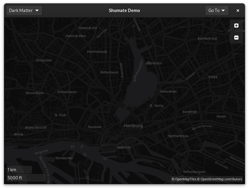
OSM Liberty, the style that the Experimenal Map mode used in 45, wasn’t bad for this purpose. It has icons for many types of places, it uses color to distinguish different types of roads, and it has the detail we need. But it’s not a perfect fit. It has no dark variant, which is an important part of the GNOME platform. It also doesn’t incorporate some newer techniques like localization, highway layering, or complex text formatting. Sure, we could add those features, but at that point we’re basically making a new style anyway.
Besides, I wanted to make a style that’s unique to Maps, to give it a distinctive identity. It should be something we can tweak and improve over time, that’s designed to be the best possible map for our app.
Design Goals
I started out with a few goals in mind:
- Compliance with GNOME’s HIG. The map style should follow GNOME’s Human Interface Guidelines. This encompasses typography, color scheme, icons, dark mode, accessibility support, and overall design ethos.
- Worldwide usefulness. The map style should be suitable for use everywhere, not just in a few regions or cultures. For example, a purely car-centric map would be of less use in much of the world.
- Compatibility with libshumate. There are a few limitations to the vector renderer. In particular, it doesn’t yet support text outlines, so label colors need to be chosen carefully to be readable on any background.
On a technical level, the style was very much inspired by the OSM Americana project. They have been pushing the limits of what MapLibre can do, and their style is much more than a static basemap. It’s a dynamic, data-driven map that brings relevant information to the forefront with localized names, highway shields, and more. While GNOME Maps looks much different visually, it uses many of the techniques that OSM Americana pioneered.
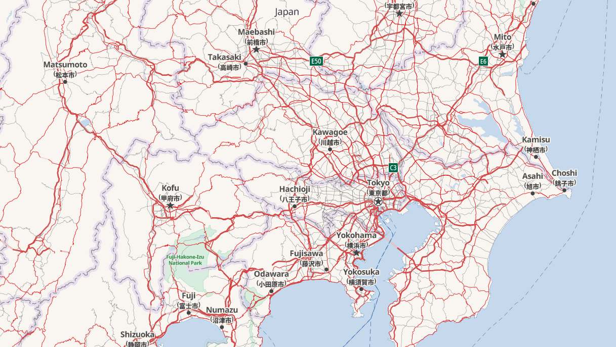
One such technique is simply the use of code generation. Rather than being a static JSON document, like many existing styles are, Americana is generated using JavaScript. This allows for much more complex logic, such as the loops that enable correct highway layering.

Making the Style
I started with the high-level features, like water, borders, and place labels. Without those, it’s hard to even navigate the map. I originally used the same color palette we use for app icons, but many people told me it was much too saturated, so I toned it down quite a bit.
Next was roads, which are the most complex part of the style and took a lot of iteration to get right. They need to be the right width at each zoom level, and the colors should clearly indicate the type of road without the color differences being too extreme. Bridges and tunnels should be indicated, and the labels need to be readable no matter the style of the road. And on top of that, there’s pedestrian and cycle paths, which I wanted to be visually distinct without feeling less important than vehicle roads.
Then there’s buildings, which are a bit simpler. They should be a neutral color, but still stand out from the background. I decided to make them visible, though faint, at zoom level 13. It’s not too useful at that zoom level, but it gives otherwise empty areas a bit of texture. And at higher zoom levels, they’re more prominent.
Landcover was tricky because it adds more background colors to the map. It wasn’t hard to make it look good on its own, but it was hard to make it work with the other features without reducing contrast.
Railways were also important to me. Most other maps don’t show them very prominently, but I think it’s valuable to remind people of their transportation options, and railroad tracks can be useful landmarks. While most maps use gray, I gave them a distinctive pink color. And then to continue the transportation theme, Marcus Lundblad added ferry lines and gondolas. So no matter how you’re getting around, hopefully Maps can show you the way!
Points of interest (POIs), like shops and restaurants, were the last major feature. They required some work on the libshumate side, but now we can use symbolic icons from the Adwaita icon library. Many of the icons I needed were already there, and Jakub Steiner from the GNOME design team made a bunch of new ones for us. The lack of text outlines was a bit of a problem when it came to coloring the icons, but I think I found a good balance for contrast.
Highway Shields
Another awesome feature of OSM Americana is highway shields: the symbols that distinguish different route networks, such as the US Interstate system. Fortunately, most of their work was reusable. I had to port the drawing code to C, but the logic and the SVGs were already there. Thanks again to all the Americana contributors for making this possible!


Available in GNOME 46!
The new style is available in the “Experimental Map” mode in GNOME 46 or the nightly flatpak. Give it a try and let us know what you think! Now that it’s merged, bugs or feature requests related to the style can be submitted to the Maps issue tracker.

The vector renderer has been three years in the making, so I’m extremely excited to finally see the fruit of all my effort!

